
October 14, 2015

October 9, 2015
October 6, 2015
Design Dictionary
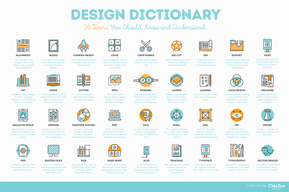
- Alignment. This dictates how images, texts, and shapes are arranged and positioned. It is usually defined by setting it as left aligned, right aligned, centered, or justified.
- Bleed. The bleed is the part of the page that gets trimmed off once the image is printed. In case there are important aspects that are part of the page’s bleed, then the document should be printed on a larger sheet of paper and trimmed down from there.
- Camera Ready. When a document is declared to be camera ready, this means that it is ready for reproduction and could now be printed out or sent to the printers.
- CMYK. CMYK stands for Cyan, Magenta, Yellow, and Key (black). These are the basic colors used for documents being sent to the printers (newspapers, magazines, flyers, etc.). On a traditional press, the first three colors are aligned or ‘keyed’ to the black plate, which explains why black is also called Key. If there is a need for a fifth color to be added, these are created as separate plates.
- Crop Marks. These are often seen on the outside of printed pieces. They are guides used as each piece is cut to its final size.
- Die Cut. Die cuts are used to print documents that require unconventional shapes. It is a metal ruler that can cut shapes on different kinds of materials.
- DPI. DPI stands for dots per inch, an acronym used to measure resolution. Based on the name itself, this measures how many dots there are for every inch of printed space. As you increase the number of dots, the image quality improves. For images to be printed, 300 DPI is usually the standard resolution.
- Export. This means that you are saving the file in a format that can be used by a different program. The Export function often allows you to open the file in computers that do not have the same design software that you do.
- Font. A font is an element of typography that dictates the style and size of displayable text characters under a typeface.
- GIF. A common format used for images, it can either be static or animated.
- Grids. Grids are a series of horizontal and vertical lines that intersect and allow a designer to add structure and organize content. It helps to balance and lay out the entire composition.
- Gutter. The gutter is the space created when a book or magazine is bound. It is the blank space between two pages facing each other.
- JPEG. This is short for Joint Photographic Experts Group. One of the most common image formats used, it is best used for images that contain gradients.
- Kerning. Kerning is the spacing between characters to make the pairing of every two letters more balanced. For example, if an A and a V were placed beside each other, the top left corner of the V will often be aligned with the bottom right corner of A so that the text, as a whole, appears more balanced.
- Layers. Layers are tools within design software that separate tiers of information, shapes, and images from each other. They allow effective organization and editing of the design work done on the specific software used.
- Leading. Leading is the vertical space that sets each line of type apart. As a general rule, the leading used should be 1.25 to 1.5 times bigger than the font size to make lines of text easier to read.
- Logo Design. Logo design is the process of creating a visual identity that represents a company, brand, or individual. It is important to understand what logo design really entails because many people interchange the terms "logo design" and "branding". Logo design is actually just a single process that contributes to the more complex realm that is brand development.
- Measure. Measure is used to define the width of a text block. This is important if you want to give the audience an optimal reading or viewing experience.
- Negative Space. This is the amount of space around the shapes and words used in a design piece.
- Orphan. This is a term used to describe a group of words or a short line towards the end or at the beginning of a paragraph. These can create an unwanted focal point as they become isolated from the rest of the content. While an orphan is a lonely word at the end of a paragraph, a widow is a short phrase or word that lies at beginning or end of a column. The result is similar: orphans create too much white space between paragraphs, while widows make sentences within paragraphs seem disjointed.
- Pantone System. This is a color matching system used in the printing industry. It uses the number system created by Pantone to effectively identify the colors used.
- PDF. Short for Portable Document Format, it is a popular format used for documents that are being sent for printing.
- Pica. It is a unit of measurement used in typesetting. One pica is 1/6th of an inch. It is a measure used by different design software such as InDesign.
- Pixel. A pixel is the smallest element on a single raster image. Each image is made up of small pixels that, when grouped together, form vivid objects in the eyes of the viewer.
- PNG. This file format is short for Portable Network Graphics. It is great for web design, and supports transparency around images.
- PPI. Another measure for resolution, PPI stands for Pixels Per Inch. Using the same concept as the one used in DPI, the more pixels for every inch, the more detailed the images are. The standard is 72 PPI for digital images.
- Proof. This refers to a copy or preview of what your design will look like. Another term used for this is ‘mockup’. A proof is often printed out or sent to a client so that they can review the material before having it printed.
- PSD. A format used for files that come directly from Adobe Photoshop.
- Raster Images. Raster images are also known as bitmap images. They are made up of thousands of pixels that dictate each image’s form and color. The best example of a raster image is a regular photo, and the most common tool used to edit a raster image is Adobe Photoshop.
- RGB. This stands for red, green, and blue, and is a color mode used to display vibrant images on screen. Designing for print often requires switching to CMYK color mode (described above). Failing to work in the right color mode will result in "automatic" conversions, leading to loss of quality and fidelity.
- Sans Serif. A common typeface style where letters don't have small lines (serifs) at the ends of each character. Some popular examples are Helvetica and Gotham.
- Slug. A slug is an optional space that a designer adds to a document to display information that won't be part of the final product. It often contains copyrights, notes, or other information that is part of the proofing process.
- Tracking. Tracking is similar to kerning, but tracking applies an even amount of space between characters.
- Typeface. A typeface is the entire design set for a group of fonts. These often come in families that contain similar attributes.
- Typography. Typography is one of the basic fundamentals of graphic design and allows the designer to arrange the type used on any composition.
- Vector Images. Instead of having pixels like the ones used in raster images, vector images use points that have X and Y coordinates. The points are then connected to form shapes, and colors are applied within each shape that is formed. Vectors can be resized endlessly without quality loss. A popular tool to create these vector images is Adobe Illustrator.
Although there are already a lot of terms on this list, know that there is much more out there that you'll eventually have to learn. Work on understanding these terms and knowing where and how to use them. Try to read about emerging terms and tools that affect your industry. An exciting design career awaits!
Subscribe to:
Posts (Atom)